Photoshop task - DVD cover
For my first assignment I decided to create a DVD cover using Adobe Photoshop CS6.
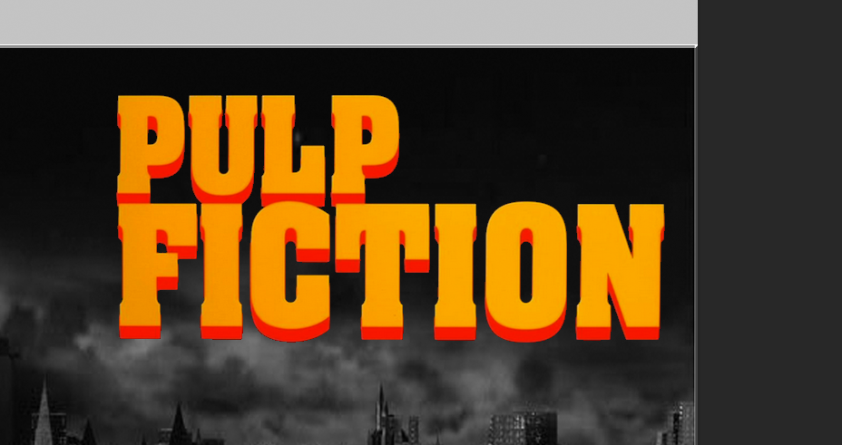
I did some research into what a DVD cover should look like and all the necessary features I should include, as well as some thought on how I would use Photoshop in order to incorporate these. I decided to create a DVD cover for a fictional Pulp Fiction sequel.
First I used a template of a standard DVD cover which was available for me from my colleges website.

Then I found an image on the internet of a city skyline. I wanted it to be dark and eerie so searched for "Gotham city skyline", Gotham city being the fictional city from batman. The original image has since been removed so unfortunately I cannot link it.

Once this image was scaled to fit the cover, I located the specific "Pulp Fiction" typeface on google images (at http://shebloggedbynight.com/wp-content/uploads/2013/12/pulp-fiction-book-title-screen.png).
I used the magic wand tool located in the top right hand corner of photoshop (located below) to remove the background from the image and just leave the text.

I then needed a "part two" typeface which fit in with the design. I remembered seeing one I liked on the cover of the DVD for "The hangover part two". I located the image at https://blogger.googleusercontent.com/img/b/R29vZ2xl/AVvXsEjSWUqFnJ052BGLhNwKgDJ2jU1cK8hUQX3eicnK7EH_Rbf4hZZQoDNUZ2v5c2kcf-8DvS_OQoBC1SuYK_CT8sSjnBC67LIRwMqRVUfBFwGzdgeN-6SFG37e_hcg9tDHG_i3DR1PwlG1HWCD/s1600/se+beber+n%25C3%25A3o+case+2+poster.jpg, before cropping the image so just the "part 2" typeface was left. Finally, I used the same magic wand tool as before to remove the existing background.

Next, I located a font similar to the pulp fiction classic style on a website dedicated to fonts, called dafont.com. The link for this specific font is http://www.dafont.com/pulp-fiction-m54.font. I typed out the desired text on the website before using the snipping tool to take a screenshot of the font. I used the aforementioned magic wand tool to remove the background, and the colour grade tool as shown below to change the font from black to white, so as to make it stand out against the background.


From my research, I was aware of a small grouping of information on the lower back cover of all DVDs which I recreated by using this image https://blogger.googleusercontent.com/img/b/R29vZ2xl/AVvXsEh8XvJwk-XO1WFaY7cAbRVYRwYXsT_gDswojtIrzX_w0O5yGAtye29g9ICRP3Fj1AKNJIlqjO1diTFMTcbH5mlTvKzps97R4IsmU4E-mrydNgz70sUbQ2f98umcYab1ncg1XDPkwGiuXVbf/s1600-h/dvd+cover+5.JPG, before using the magic wand tool to remove the unwanted black background.

I then found the standardised "DVD" logo which is a necessary requirement for all DVDs to display. I found the image at http://gamesworldbodmin.co.uk/images/744px-DVD-Logo_svg.png. I used the magic wand tool to remove the background and the colour grade tool (as shown before) to change the colour to white in keeping with the colour scheme.

I found the two fifteen age rating images at http://seeklogo.com/images/B/BBFC_15_Certificate_UK-logo-BF5F5479FA-seeklogo.com.gif. It is a requirement for all DVDs to display an age rating on both the front cover, back cover and spine. I moved and scaled them into position and used the magic wand tool to remove background.

Lastly, I entered my desired text (a small T located on the right hand toolbar), for the back cover, including the names of two of the "stars" of this film and a brief description of the storyline or "blurb". This is also commonplace on DVD covers. I changed the font, colour, and size using the font section of the toolbar in the top right hand corner (as shown below).

Pictured below are all the layers that made up my DVD cover.

In hindsight, I would attempt to be more adventurous with photoshop, as I feel I perhaps overused the magic wand tool. However, this was the most effective and simple way of getting the desired result, which I believe (from my research) includes all the necessary DVD standard requirements.
No comments:
Post a Comment